Thank you so much everyone for your input on yesterday's post. I am seeing things today in a completely different light (literally and figuratively). Bare with me while I ramble on this afternoon... until the kids' buses get here anyway. I think yesterday's slide show shoot at the studio caused a slight identity crisis in me and I decided that the reason I was seeking so much validation (here, twitter, and facebook) was that *I* didn't actually like any of those shots. Yeah, that is right, deep down I think those shots all sucked.
You see, part of me feels like I have absolutely no freaking clue what I want to do with my "creative" life. Right, I just went from which picture do you like best to oh my stars what do I want to do with my life! I said it caused an identity crisis!! Do I want to write books, do I want to teach, do I want to do art shows? What the heck do I want to do? And for the past 5 or 6 years, I have been dabbling in all three of those, and then some if you count the forays into mixed media that I do too. Yesterday, I was knee deep in my "I-want-to-do-art-shows" mentality and that, my friends, is a place that strikes fear in heart. I instantly don't feel good enough. Putting myself out there to quite literally be judged and decided to be worthy or not worthy for inclusion in an elite community of fine craft artists leads to an inane amount of insecurity. So, what do I do? I put on a weird mask, in the form of black backgrounds and reflective surfaces, I stop being *myself*, and I try to conform to a standard that is quite possibly unreachable.
I can hear a voice in my head right now. It is that of a very good friend of mine (and I am sure she will recognize herself right away). She is asking me "what is it that makes you feel fear about shows", "where is the fear coming from" and "what about you feels like it isn't enough"? She is so good at making me stop to think about that I am doing without thinking. Meaning, I am letting myself feel and act without thinking about it. I need to stop and think about what I am thinking. (my stars, that is heady) Such a good friend, even when we are having a conversation in my head that she isn't privy to. To the voice in my head, I think... the answers to those questions would take too many sentences to write, but in my heart I can *feel* the answers. Do you ever have that happen? Where you don't need any words to tell the answer to something... it doesn't need to be articulated... you just know it through and through? It is something I will try to put into words for you at some point, but for now... let's just stick to the slide pictures thing.
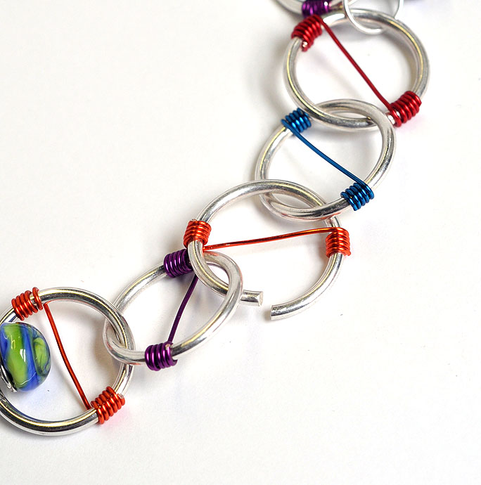
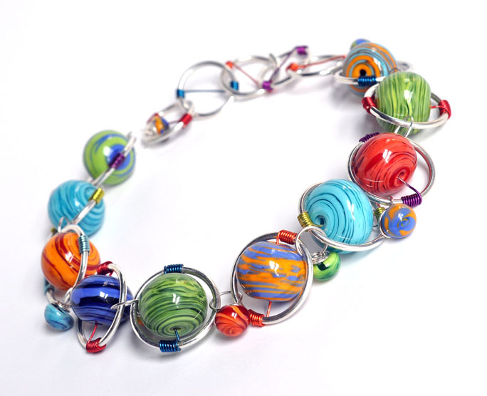
I started to settle into a different place mentally last night. I spent the evening helping another friend (not the voice inside my head one) get her blog set up (I'll share it soon!)and we were chatting about the slides. I told her how in my gut, I really wanted to shoot the pieces on my usual white backgrounds, but so few people do that and what if it blinds the jurors that look at slide after slide that is set to a dark background... She was totally on board with white and encouraged me to go for it. SO, I did...
This will be one of the slides I use to apply to shows in 2011. I still don't know for sure what the answers to those first questions I asked myself are... the ones about what I want to do with my creative life. But I do know this... if I am going to enter art shows, I want to know I was accepted (or denied) being true to myself and my work. And I am feeling OH so good in that decision. I am also going to apply the same thinking to a booth redesign too! I want to simplify and streamline my displays, make them more *me*, and in doing so take some of the pressure to make-so-much-stuff-to-fill-my-current-set-up off. It is really invigorating. And I can't wait to share more of my path down this more thoughtful approach with all of you... thank you readers, for being here with me.






15 comments:
Kerry, I missed your last post, but went back and read it. I would have to agree. I didn't think that any of those pictures were you, but someone trying to be what others thought they should be. I think that your pictures on white are refreshing and allow the color to not compete with the shadows and reflections in the black background. I love this new look! The beads, the wire, the whole concept. So you! Enjoy the day!
Erin
Kerry,
I like the white backgrounds.
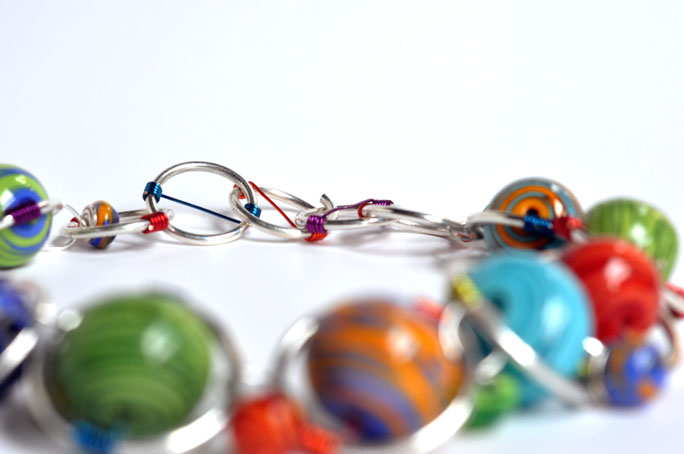
I thought I would point this out, because perhaps I'm not the only one like this. I am partially blind in one eye (only the lower hemisphere) and related to that, I find it extremely difficult to focus when there is off focus blurryness in a photograph. It is almost like the photo's blurryness is competing with my own biological blurryness and my natural reaction is to look away instead of spending any time with the photo. Therefore, I much prefer your photos where everything is in focus (or only the furthest elements are slightly off focus) than the ones where the foreground is off focus - I just find them hard to look at, and I fear a jury might too.
That said... WHAT A COOL NECKLACE OMG I WANT ONE.
*ahem.*
Thank you so much ladies!
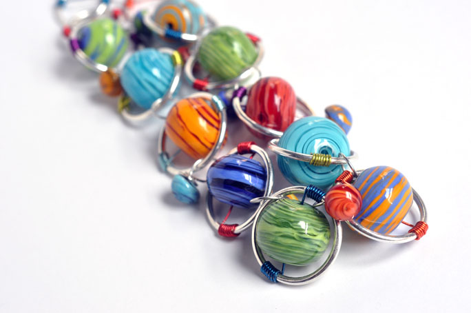
@Stereoette - your input is much appreciated. and just so you know, only the one image of the entire piece will be submitted as a slide. the three others at the bottom of the post are just for the blog to show details of the necklace. i am so sorry to hear the blur fights the blur you already see. personally, i love that kind of depth of field in a shot but i completely understand where you are coming from.
Yes, yes, yes - the white background is really great! I am always leary about taking photos on white, but you nailed it.
The white is reflective and seems to carry the piece forward, as an offering to the viewer. The dark background appears to swallow the piece and subdue its presence. White is better. Your piece is light hearted and lovely.
Kerry-
After I read the first sentence or so of this post, saying that you were referring to a previous post, I went to read that one first. The whole time I was looking at the old pictures, I was hating the dark, depressing background. It is the polar opposite of your jubilant use of color. Then I went back and read today's post. When I saw you, too, were troubled by the dark background, I thought, "I knew it! It's all wrong!" Your work just sings when it is on a white background. Go for it and keep us posted!
Amazing. I love the white. Normally, I love the dark gray - but you know what you're doing with the camera and that, my dear, makes all the difference in the world.
I'm new here and don't really know you, but I'm thinking that going with your gut is always the right thing. I've learned to "try" to trust mine.
i just now went back and checked out the grey photos..
they would not have shown well for a jury.
the jury has to look at thousands of photos, each one only getting a few seconds view ,not minutes.
your work has to stand out, really jump off the screen..
there was too much visual competition happening with that grey background.it was too dark and muddy,dulling out your colors plus the glass or whatever it was added a confusing reflection that detracted from the shine of your own piece..this white works beautifully it's clear and makes your colors pop.
for another 2 cents ..art shows, stopped doing those ages ago..now only wholesale,
online sales and galleries..shows can be fun..but books reach more people to advertise your work.
You know, I was ok with the dark background but when I saw these new photos on white, I thought yes that is Kerry. Good move!
Bravo for you, Kerry! Way to make it yours, and I have to agree - I didn't have a problem with the dark background, but the white one feels instantly more "you".
And if your photos startle the judges because it's on a white background? Good. Grab their attention and make them look.
I'm glad you went with what was more you. Love the photos with white!
My Blog
Oh Kerry, the white is so much better - you have such fresh colours and designs that the dark was not bringing out. I'm a big fan of white, and shoot my humble pieces with white backgrounds.
Your designs are so wonderful and original - keep the bead faith !
Vicki
The white shows off your fun, colourful beads so much fun.......love the photos and the necklace!
OK, after the reshoot, definitely the white background. The colors just pop out and make you want to explore. I always look at the photos of what I call the 'master' lampworkers. You'll notice that they're all shot on white backgrounds ~ the glass comes alive.
And if those jurors don't select you, well their loss and just go on to the next one!
WHITE WHITE WHITE YES YES YES
The black back ground was not flattering to your bright colors at all.
Lisa
Post a Comment