
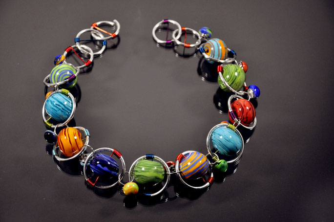

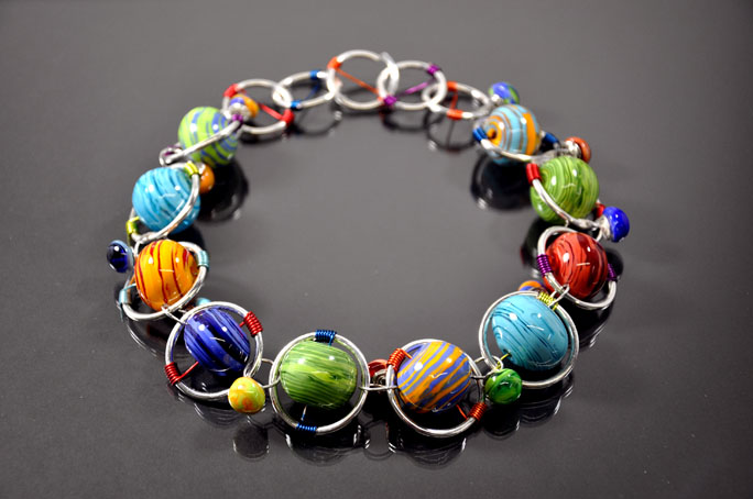
These are options 1, 2, and 3. You'll see the first is off center with the clasp open. The second is centered with the clasp still open. And the third is a slightly brighter image with the clasp closed and necklace centered.

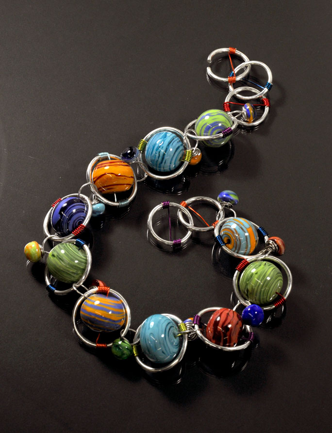
These two are the vertical shots I took. Which I like, but I think the second might have you wondering if it is a necklace or a bracelet. Ugh... it is so hard to decide!! If you are wondering at all about the necklace itself, those are gigantic hollow beads wired to ginormous 10g sterling silver forged rings. The rings are connected by sterling and glass headpins and the clasp it an open ring that interlocks with the last. *sigh* It is wild, and I love it.
Please help me pick one!
Oh and if you are interested, you can view slides from pervious years: HERE, HERE, HERE, HERE, and HERE.


29 comments:
first and last... Mainly the last one, because you can see not only the glass work but also the wire work.... I believe juries accept only 1920 x 1920, since the maximum is 1920, one of the sides might end up being much smaller.... It always take me more time taking photos and selecting than making the beads!!!
They're all beautiful, but 3 and 4 are my favourites. The bracelet is cool.......so bright and funky! Btw how did you get the grey/black background?
thanks for the tip Laura! i have the requirements sheet for the final images, i just posted these this size to fit the blog.
Ali... SEE what i mean!! it is comign off as a bracelet, instead of a necklace. background is a piece of black paper under a sheet of glass from a picture frame.
Beautiful work, I love number 2 the best.
I think I like the last one the best. I prefer when it is all in focus. And it looks more like a necklace that the others.
Beautiful! Ann
No it doesn't look like a bracelet.......I'm just half asleep....up all night coughing with a crummy cold. Anyway, the necklace is amazing! :)
2 and 3 are easy on the eyes so I'll go with that for my vote. The others are a little "in your face" which make it hard to see without have to step back and look at it. The necklace is very beautiful!
I like #1 best. The round arrangement compliments the design nicely and is easy to look at. I also like the slight off-center placement for interest. #3 looks too light to me, but it could just be my monitor. I like the last picture because it shows the wire work best, as someone else noted, but to highlight the design as a whole I still love #1. Awesome design, good luck!!!
I'm voting for the first and the last b/c you can see all the elements clearly. The others, while arty and beautiful, don't show the details as clearly!
I like the first one the best. To me, it just seemed clearer - maybe just me. It's a fun piece - really like it. Good luck
I am torn between #4 and #5. Both are beautiful and show the colors, beads and craft really well.
I think its the first and the last for me. Love it, the colours are beautiful and the wire work really sets the beads off.
I like the last one best, it showcases your craftsmanship the best and the layout is creative and eye catching.
I like the second one; round and closed. It's the tidiest and it lets the design really pop. I LOVE this design! It's one of my favorites of yours. How does that clasp work?
I like #2 - perfectly centered, and the highlights are too bright. I like #3 but the colors aren't as saturated there.
2 & 3 - i can see either one of them in a brochure for the show - or on the cover... they love bold and colorful...
I vote for the 1st one. It looks very professional and perfect for a juried slide. I knew right away it was a necklace. And I love the black paper and clear glass on top for the background. I'll have to tuck that in my back pocket:-)
I like the 2nd option in each of the 2 photo styles. They have the best lighting so that all the beads have good exposure.
Without looking at what others have said before I comment, I like the last photo best personally but if you are looking for a shot that more looks like a necklace I would pick the first photo. Love the entire necklace!!!!!
Kerry, what a stunning necklace - love the lampwork colors. It is such a clever design. I see you have a variety of votes here - mine is for #3, just to be different. :-) For some reason I like it centered just so. You can't go wrong with any of these pictures!
LOVE it! I like numbers 3 and 4. I think it's good to see the clasp closed and also I like it centered. SUch beautiful beads!
The last one. Easily peasily lemon squeezily!
But you might wanna lighten it up a bit in photoshop. I also find the scale a bit difficult to grasp. They could all be taken for a bracelet. How about a prop to help us.
And did I say - it looks AMAZING!
I like the 2nd image, as well as the 5th one. In #2, I liked the fact that the necklace was clasped, and it really appealed to me that it was arranged in a perfect circle, mimicking the circular rings in the piece. I also liked the unique arrangement of the necklace in #5, because it gives a great view of the individual beads and wire.
First and last for me, best focus and both said necklace to me for some reason. I like the last the best except for the little shiny reflections. If you have photoshop those could be quickly fixed (about 10 minutes total) with the cloning tool or the healing tool (I prefer the healing tool)
I like the first one and the last one. I like the contrast of the first one and the colors of the beads are rich. I also like the last one, you can see a lot of the detail and the shot has good color and contrast. I also use a piece of paper under glass from a frame...it works really well! Your work is so beautiful you are very creative!
i've been thinking - #2... i like the contrast against the darker background...
The first once shows the detail and color the best.
And I do love the beads and how you framed them ~ Kerry style.
Can't see how anyone would not accept your work!
I like the last one the best.... Beautiful necklace!
I dont like any of these shots. They arent you. Theres something "cold" about them. They just dont seem to have the warmth and happiness your other photos always have. I love your work just not these shots of them.
Post a Comment