I have been a bit of a space cadet mentally the past week and, obviously, very rightly so. Last week, I had all the Tuesday Tuesdays planned out in my head for weeks to come. I am finding I really should have written them down because... hello? are you there thoughts?... nope. LOL. So, forgive me today as I keep things kinda on the light side, rather frivolous and "behind the scenes" instead of "how to".
Before we dive into talk about the cover of Totally Twisted (signed copies available here), I want to have a brief chat about the photography. I am going to be completely honest with you, when I first saw the proofs of the "beauty" shots (these are the large shots of each project opposite the project descriptions, tools, and materials lists), I had a bit of a panic attack. Okay, it was more than a bit of a panic attack, it was bordering a meltdown, lol. Why? Because I hated them. I don't know what exactly I expected, I just knew it wasn't what I was seeing. I was thinking "are you serious? chunks of broken glass? are those upside down ballet slippers? seashells with yellow water? what the heck?" I put in a frantic call to my editor, who tried put my mind at ease, and did a little, but not enough to keep me from putting another call into a different editor. Talking with the second editor (my acquisitions editor) was what ended really calming me down. She said something to the effect of "let's just wait and see what the book designer does with it. Maybe they will be able to pull it all together." She was right.
I should mention, I am going out of order here. When we waited to see what the designer would do with the photos, the first thing I saw was the BLAD (book layout and design) not the cover. I will definitely be doing a post about the BLAD, but the cover is what you see first, so I thought I would go with that.
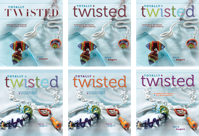
Once I saw the BLAD and cover samples, I was able to get an idea of the direction things were going and I started to like what I was seeing. The opening shot at the top of this post shows the first six design ideas for the cover. For those of you that aren't familiar with publishing, it is really surprising just how many people are behind all the decision that go into picking the cover of the book. There is the art director, the acquisitions editor, the book designer, and even the marketing director (they want a cover they can sell after all). From what I hear from other authors, I am lucky to have been able to give input on the cover at all. A lot of publishers work into contracts that all design decisions are theirs to make. I specifically asked for a clause to be added to my contract so that I would have design input. Thanks Interweave, it is one of the many reasons I love working with you!

Marketing decided that two pieces on the cover was a must. So, we focused on layouts 4,5, and 6. I had my heart set on the cover projects showing beads made by me, so the Bang Gal! made with Cassie Donlen's lovely beads was in the end swapped out for Unhinged. When playing with the different fonts in the second round of revisions, the photo hadn't been reshot, so that is why you see the samples showing the Bang Gal!. Check out all those wild font ideas! I loved the curly dot over the "i" in "Twisted". I also loved the upper lower case combo of the second sample too. Ultimately it was decided to go with the simpler font, move the accent dots around, and change the colors. I love what we ended up with. And now I can't imagine it any other way!

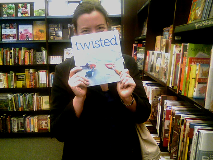
Now how freakin' stinkin' cool is this?!? My sister and I went out to lunch and popped into the local Barnes and Noble to see if Totally Twisted was in stock yet. We looked and looked and thought is wasn't in. Then with a loud screech I saw it!! To continue the writing-a-book-is-just-like-having-a-child analogy I have used before... I swear, leaving the store without buying that copy was like leaving my child at the babysitter's for the first time. I seriously wanted to call the store every five minutes to check on it. I resisted though, LOL. Thanks to Bonnie for getting this shot for me. *sigh* I still can't get over it... I wrote a book and it is on the shelves!!


7 comments:
I love this glimpse into the process, Kerry. Really taught me some things I wouldn't have expected, like not being able to give design input, even a little. I like seeing the progression of the covers. I think it would be fun to come up with all those (I am a font freak). Enjoy the day knowing that your 'baby' has been placed in so many capable hands and will fly on its own wings! Erin
Wow! You look great holding your book, and what an amazing feeling it must be.
I'm lovin the behind the scenes blogs. Can't wait to hear more.
Thanks for sharing the behind-the-scenes adventures...it really makes it much more fun to know how much love and fun went into this book...and now I have to go coil something!!!
Your book has just arrived today. It took a little longer because I live in Germany. But after a quick glance: LOVE, LOVE, LOVE IT!
Kind regards Stefanie
Great story on the book cover. In the end, the final version is THE best! And, yes, positively, YOUR beads on the front.
Can't wait for your next "making a book" installment.
sandi
ps - My condolences regarding your Grandfather.
Scary and exciting at the same time. I loved seeing a bit of the process for publishing a book.
And how fun for you to see it in print!!!!
Congratulations!
Kerry, I enjoyed again reliving the experience of selecting the cover... it's amazing all of the options they/you considered. You're right, you picked the perfect one in the end. When Randy picked up another copy of TT for me, it was the only one left on the shelves!....guess what? I'm in OC!
Post a Comment