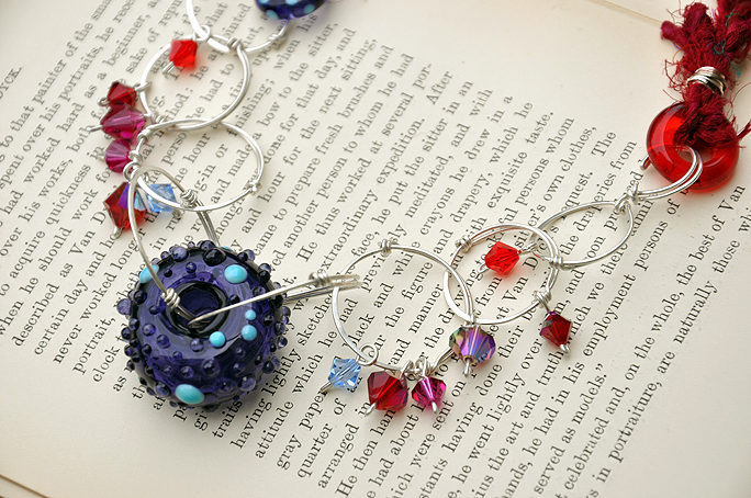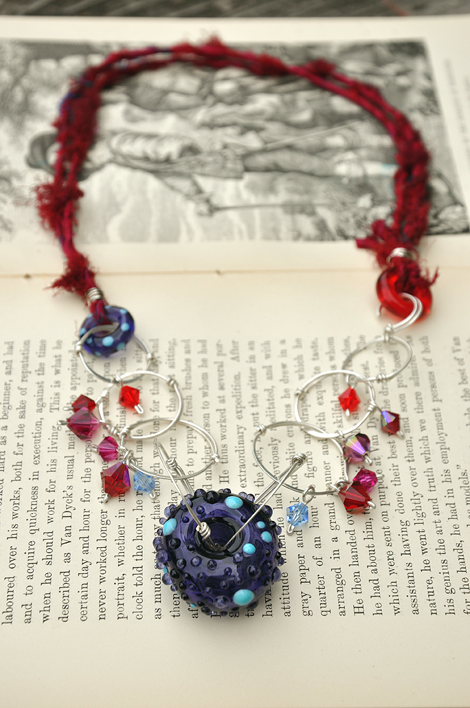

About a month or so ago, I found the blog brandi girl:: a life inspired by color (I think I found it via Lorelei's blog). Obviously, anything with the word color in the title instantly gets my attention. I have really been enjoying her color palette posts where she shares a photo and creates a color swatch from that photo to use as color inspiration. (In fact, I will share a pendant inspired by the "vegas boneyard" shot soon.) I thought it might be fun to dissect the color I used in this new piece in a similar way. Color is a huge part of Totally Twisted and it is also something I think a lot of people struggle with. Depending on how this goes, you may see me dissecting colors more in future posts.
So, this new piece, it doesn't really have a name yet. Though my friend, Tricia on FB, suggested "Betsy Ross Does Donuts". The "Betsy Ross" part is sticking for me but not so much the doing donuts bit. It sounds somewhat inappropriate to me, lol. Hmmm... maybe "Patriotic Petticoats"? Yes, that fits. But we aren't here to name things, we are gonna talk about color today!
For me, when working with color, I tend to start with two main colors. In this case, it was purple and red. If we are getting specific, it was a transparent purpler ink blue and a rich transparent red. When I want to pull to seemingly unworkable colors together, I try bridge the color gap between them with different variations of those main colors. It is easier to think about it when you imagine a color wheel, but think of one of those fancy ones with more than 6 colors. How can we successfully get from purple to red on the color wheel?
Deeper, richer, shadow-esque colors are what help me move from one color to the next. I take that main color and add to it darker shades. As if that same color were in a different lower light. Then to add a POP, or a little spring to our step so to speak, I add one shade brighter than the main color. That gets our color palette sounding and looking a little something like this: blends of subtle eggplant, transparent purply ink blue, with rusty mauve, deep persimmon, rich transparent red, and pops of salmon pink and turquoise. I think how you describe the color combination has a direct connection to how well the colors work together. If it *sounds* beautiful, it most cases it will *be* beautiful. If I were just to say, "I made a necklace that is dark purple and bright red", with out seeing it in person, you might be thinking "that's prolly nasty." But when you describe the colors, as I did above, it works.
Now, don't even get me started on whether or not these are "trend" colors. I know a lot of people like to follow trends, and that is awesome! But at the same time, I don't think every day should be the same. You really mean to tell me you are going to where pale pastels for the next 3 months because someone on tv said it is what's popular? I think this necklace is just as wearable during the summer as it is in the fall. Pick your day! Not every day of summer is sunny and full of butterflies. I would wear this on a warm overcast say with a dark purple tank top and denim skirt.
Feel free to take the color combo above and use it as inspiration for a new piece! I would love to see what you make. You can add your photos to the Totally Twisted Designs Flickr Group. Just grab beads from your stash in similar colors and start creating.


10 comments:
I love brandi girl too. Probably found from Lorelei as well.
I love the way I am seeing palettes popping up everyhwere. I also follow ColourLovers, Wear Palettes and a new one called Color Composition. I want to do that with my photos but I haven't figured out an easy way yet.
Thanks for sharing your color inspiration today. Color is my big challenge for myself this year so I am trying to break my mold and spice it up with brights and great funky color combos.
Enjoy the day!
Erin
I love that red ribbon! Is it recycled sari silk? Also, I completely agree with the color trend thing. The secret group of color forcasters kind of creep me out!
Hey, wow! Thanks for the shout out - what a rush to find my blog mentioned on one of my favorite reads!
As for your gorgeous necklace... When I first saw the photo, I was thinking "mmm, jewel tones!" Which immediately made me think of rubies and sapphires in an old pirate's chest. Whatever you decide to name it, it's lovely! I like how you made your own chain!
Thanks for the comments everyone!
Erin: Open the photo in photoshop, then do "open new" size the new area to something you list (I did 1.5in x 9.5 blog post size). Eye dropper colors from the image and "paint" them in the new blank space created. That's what I did. Took all of about 10mins.
Rebecca: Yes! It is recycled sari silk, from objects and elements website. Love it, so pretty. This is the first project I have used it on.
Brandi: Hey girl!! Thanks for popping in! I love you blog and the lovely color there all the time. :) I am happy to give a shout out. You deserve it. hmmm... maybe this should be renamed "Pirate Petticoat"
I had red and purple in my wedding bouquet. There was red Gerbera, red roses, purple lisianthus and purple statis with some eucalyptus etc.. It certainly made a statement, I wasn't gonna go for those 'wishy washy pastels' I think were I used at the time. So,I totally agree with your comment about not following trend colours but using colours that relfect, or lift, your mood. Colour is so powerful.
Kerry, thank you. Describing how you connect colors was very helpful for me...just didn't know how it was done so I was staying in similar color palettes but now have a good idea of how to connect.
Wow, Kerry...what a stunning piece. It's SO different - haven't seen you use a Swarovski crystal in a couple years it seems...and I just love that sari silk. It always adds such a sumptious quality.
Oh, and by the way...when you linked to Brandi's blog, I just knew it would be a great one. I just visited and thought it was fantastic..thanks for sharing this great new find.
i love love love that deep dark crimson color!
Betsy Ross...that just makes me laugh!!! You're a color visionary...thanks!!!
Post a Comment