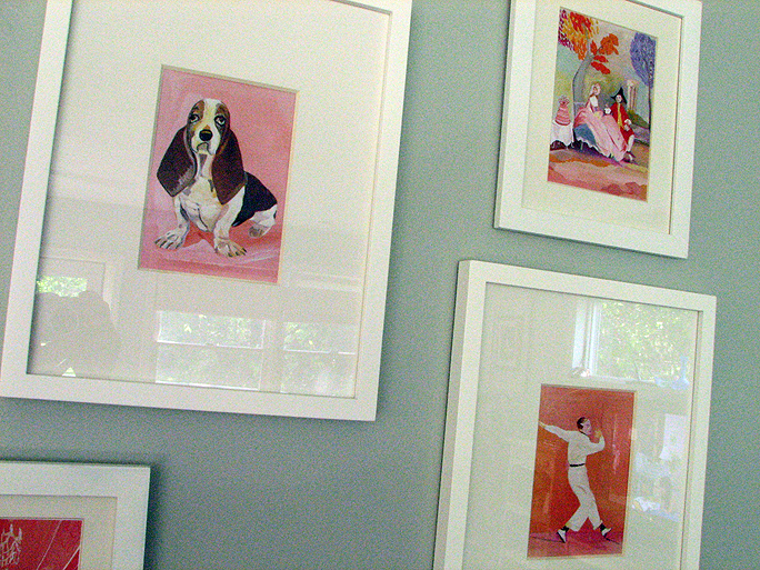
Kalman is an illustrator and this collection of her original drawings was so... lovely. Yes, lovely is a good word. And funny... and colorful. What a brilliant idea this artist had to give new life to an old stuffy book. It gives it such a personality. The titles of her pieces are names like "Well, Susan this is a fine mess you are in" to go with a basset hound on a pink background and "Know - Ledge" to an image of a man in a library and a window ledge. I slowly worked my way past each piece in the collection, smiling and even laughing out loud along the way.
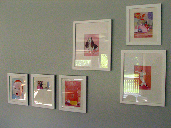
I came out of the exhibit, walked straight to the gallery store, and bought two copies of the book. Yes, two. Why two? Well, as a soon to be author I had to have a copy to read from cover to cover. I love reading this like "22. Place the emphatic words of a sentence at the end." And the second to cut the illustrations out of, matte and frame them, and hang them on my living room wall.

I have had a big area of blank wall in my living room since moving in last summer. One of the things I told myself when we moved in was that I wouldn't hang anything, anything, on the walls that I didn't LOVE. I know me, I would hang something so-so and leave it for years out of laziness. So, the rule is I have to love it or the walls stay bare. I was hugely inspired by Kelly Rae's living room picture montage. But I held off on doing something like it waiting for the right "thing" to put in the frames. Illustrations from The Elements of Style is the thing!
The colors are fantastic, I picked things with lots of soft pinks and oranges with my favorite shades of blue. Ron even likes the idea! (we don't often agree on decor things) His only request was that there be spaces between the images on the wall (no touching frames). There is a big empty space in the photo because one of the frames I bought was damamged.

I have stared at a blank wall for so many months now, it looks a little odd to have something finally hanging there. I am going to give it time to grow on me. I would love to see pics of other living rooms!! Leave links in comments :)
(Oh, please excuse the craptastic grainy photos. Something is going on with my camera, again. But I am finally going to take care of that problem... I am getting me a new camera!!)


2 comments:
Good on ya for waiting, Ker. You made the right decision.
Kerry...I love the placement and colors in your new wall display. Very clever...very Kerry!
Post a Comment